Project Lead UX Design Visual Design Branding Product Photographer Videographer Video Editor
Project Summary: Ongoing website revisions that guided the company website from a very cumbersome, dated, non-responsive eCommerce site to a fully responsive eCommerce site.
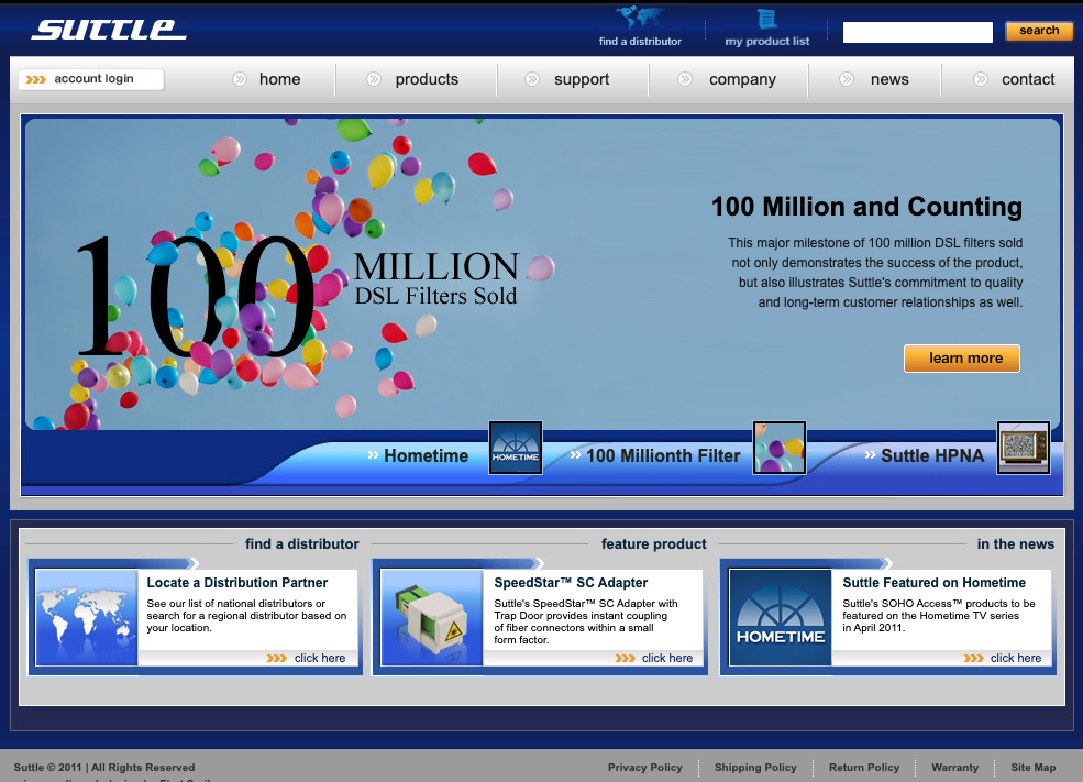
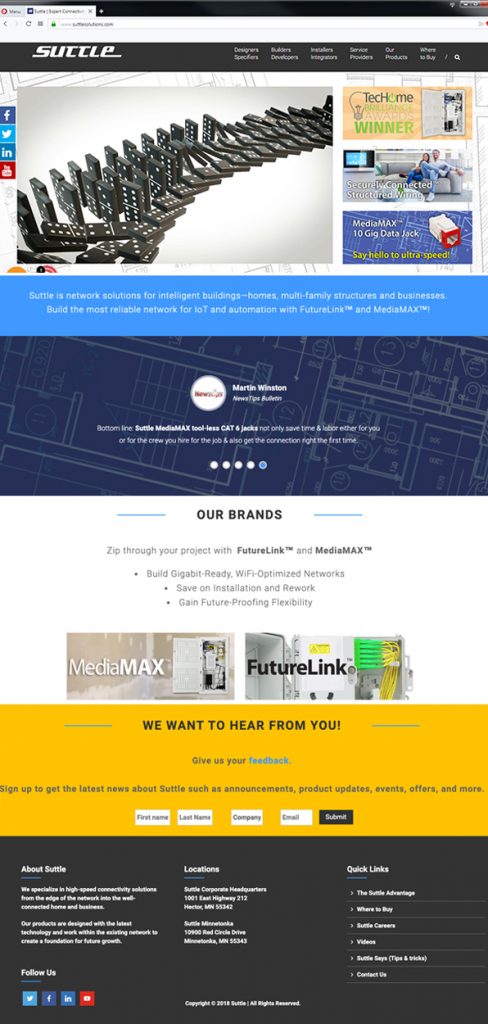
Traditional, non-respponsive site
The Challenge:
Data analysis indicated that mobile access to the Suttle eCommerce website was outpacing traditional desktop access.
Suttle’s eCommerce website was designed as a non-responsive / traditional site which made access very difficult on mobile devices. The website was also hampered by separate technologies used; the product database was housed on one technology (Magento) while the main site was using a separate technology.
A Marketing and communication plan for site launch is started in conjunction with the development of the new site.
The Process:
Ideate: Several user personas were created to outline the problem audience is facing.
Brainstorming with internal stakeholders and product experts brought about a responsive redesign solution for the eCommerce site which will solve the problem of desktop vs mobile access to the site. This solution was to take several steps due to budgetary and technical constraints.
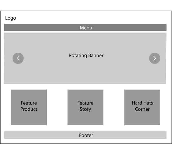
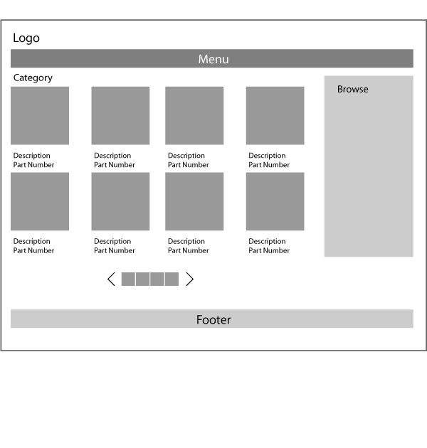
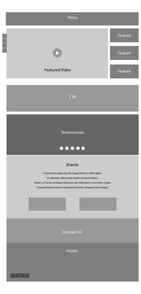
Wireframes: Basic sketches and wireframes of the new site in desktop / tablet / mobile views were created and presented to the marketing team with revisions and iterations used to streamline the customer journey through the site.
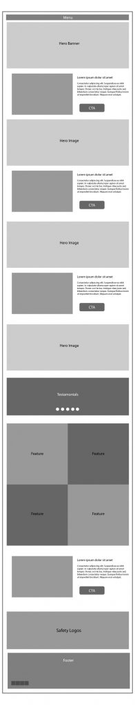
The Hybrid iteration: At first a hybrid solution was to be designed (part traditional, part responsive) to better facilitate the migration of the eCommerce database. Once the hybrid solution was in place, the migration to a fully responsive solution would be set in motion.
Design: Once the basic user flow was decided upon, the look and feel of the designs for each screen type was fleshed out using branding guidelines.
Prototype: Main areas of the new site were created and QA tested by internal stakeholders in a sandbox environment. Pain-points are identified and addressed via ongoing development refining. Is the site working as it should? On all devices? Is the speed sufficient?
Launch: A soft launch was used in conjunction with the Marketing and Communications plan.
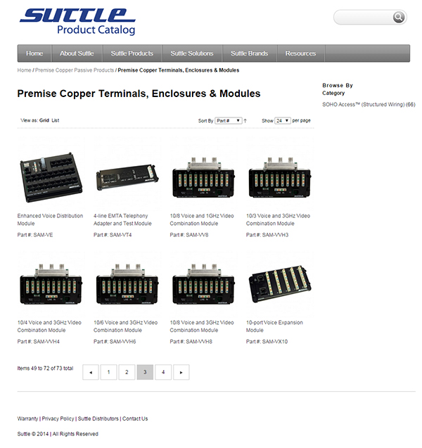
Customer persona iteration: saw the product offerings being pared down to fewer than 600 individual products which were then migrated to a fully responsive eCommerce website aimed at specific customer personas.
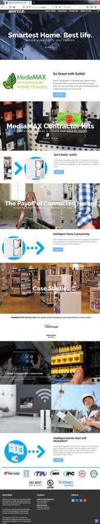
A Solution-centric iteration: was later designed after data showed that the customer persona iteration wasn’t increasing visits and click-through numbers. The change in focus proved to be much more successful in this regard.
Recognition: The redesigned fully responsive eCommerce site and updated SEO resulted in an organic first page listing and featured video of company primary products on the major search engines (Google and Bing) which drove a 325% increase in sales and a greater presence in the low-voltage intelligent home market.